Research before design
The project started far from Figma: interviews with citizens, operators and developers, and a systematic reading of help desk inquiries. A detailed map of opportunities was sitting there, waiting to be read.

Case — Digital government · Chaco Province, Argentina
The challenge of evolving a platform already used by thousands across Chaco — and making it simpler for every one of them.
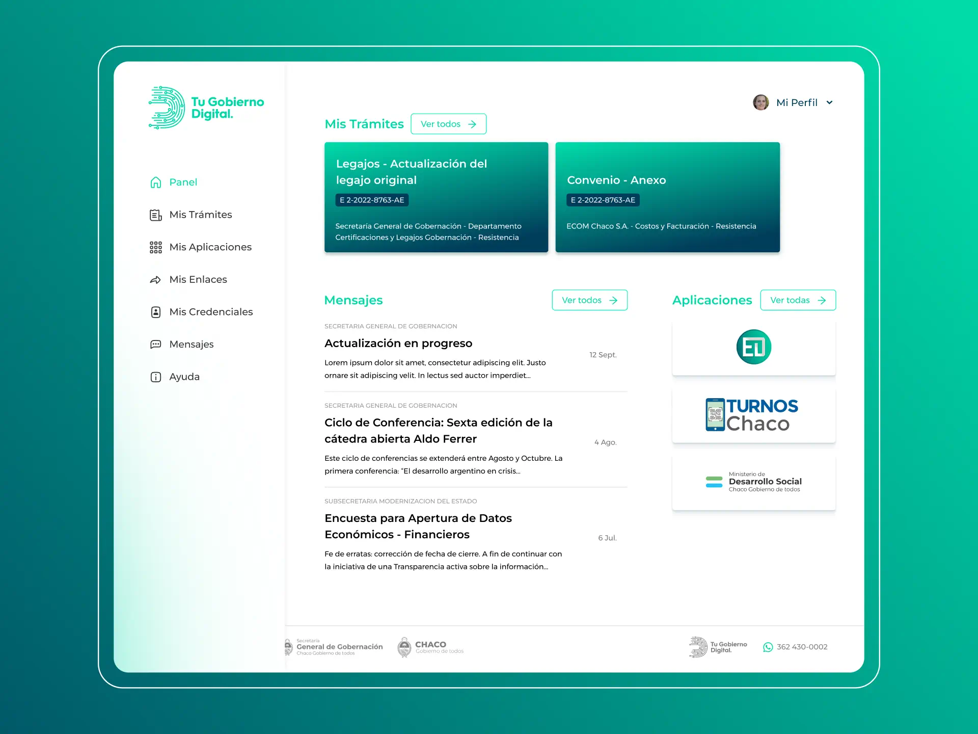
TGD is the online services platform of the Province of Chaco — the provincial counterpart of Argentina's national citizen portal: appointments, procedures, credentials and access to state services in one place. The first version was live and in mass use, and the plan for the second stage was ambitious: new features, new services, and an experience taken to the next level. ECOM Chaco, the company that develops the platform for the provincial government, brought us in to add the specialized UX/UI perspective the team needed.
Before drawing a single screen: understanding why some users couldn't complete their procedures. Turning existing data into design decisions, adding first-hand research with real users, and projecting a v2 worthy of everyone who uses it.
The approach
The project started far from Figma: interviews with citizens, operators and developers, and a systematic reading of help desk inquiries. A detailed map of opportunities was sitting there, waiting to be read.
Nothing was left to opinion: card sorting, guided tasks and heatmaps with actual platform users. Every iteration was adjusted with data.
The process
Interviews with citizens, platform operators and developers; a flow-by-flow review identifying where the experience needed more attention and where there was room to simplify. The key decision: capitalizing on sources that already existed but hadn't been read through a design lens — the call center's topic ranking and the reports of operators who assisted users daily.
New information architecture, low- and high-fidelity wireframes, responsive layouts. We designed for the least-favored user — seniors, low vision, weak connections — rather than the average one: tooltips, visual aids, tutorials and generous typographic hierarchies. Remote testing with card sorting, guided tasks and heatmaps; in every round, over 70% of testers were real TGD users.
Final screens presented to the provincial government and ECOM; adjustments from the feedback round and production of the full implementation package: UI Kit, iconography, illustrations and documented Figma files.
On-call support alongside the development team during implementation, resolving questions and specific needs so the design reached production without degrading.
The shift
Identity validation — the step that unlocks every procedure — was reached through My Profile → My Validations, a path few users discovered on their own.
“Validate your account”: a banner on the main panel with a guided process. Heatmaps confirmed it as the new natural entry point.
The same criterion ran through the whole platform: a reordered menu, clearer names, and key actions in plain sight — where users are already used to finding them.
The impact
Services provided
Timeline
Key learnings
The ranking of support topics was an exact map of where to focus the design effort.
Solving for the weakest connection and the least digital user improves the experience for everyone.
Having over 70% of testers already using TGD changed the quality of the findings.
Standing by the devs is what guarantees the design reaches production alive.